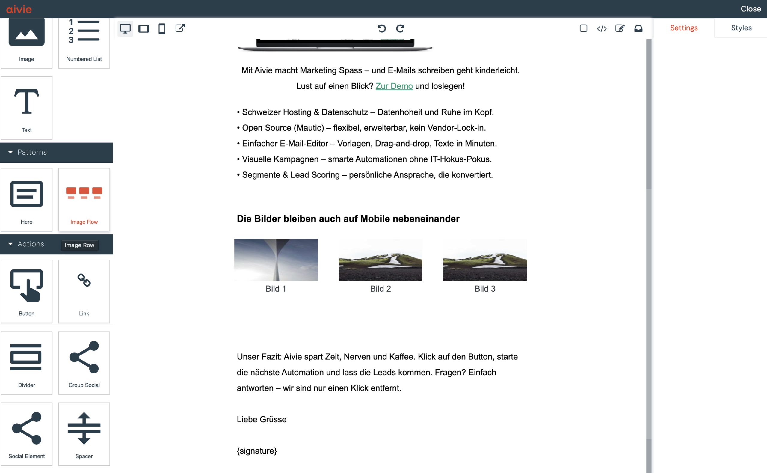
I’ve placed multiple images (e.g., 3 brand or product logos) side by side in an email.
The layout is correct on the desktop, but on the smartphone, the images are displayed one below the other, or the columns are very wide, even though the images themselves are small. What’s the reason for this – and how can it be controlled? It’s important to understand the challenges associated with multiple images on mobile.
Multiple images are often not displayed optimally on mobile devices. This behavior corresponds to the standard responsive behavior of MJML, because MJML is mobile first:
- Columns (
mj-column) are stacked to 100% width by default on mobile - This creates individual, very wide columns
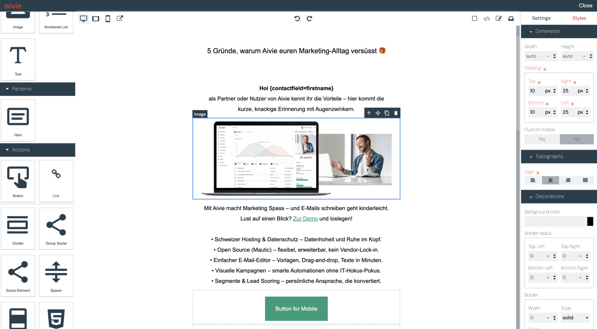
- If «Fluid on mobile» is set to «Yes» at the same time, the image will be displayed across the entire width.

What «Fluid on Mobile» does – and what it doesn’t do
Fluid on Mobile = No means:
- The image is not automatically scaled to the full width on mobile
- The defined image width (e.g.
120px) is retained
But:
- The surrounding column remains 100% wide
- The layout (next to each other vs. under each other) is not affected by this
Solution: Use mj-group for fixed columns on mobile
To ensure that multiple images remain next to each other on mobile, the columns must be logically grouped.
In MJML, a mj-group is used for this:
mj-groupprevents the automatic stacking of columns- Percentage column widths (
33.33 %,50 %) are retained - Columns within a group must have a width in percent (not pixels)
How to display multiple images side by side in Aivie

- Open the Aivie Email Builder
- Select the «Image Row» block on the left side
- Select the appropriate image with a double click
- Add more images as a block if necessary, or remove images that are not needed
Advanced: Display multiple images side by side using code
Alternatively, you can solve it via the code. Here is some example code for a layout with three images:
  <mj-group>
    <mj-column>
      <mj-image width="160px" height="80px" src="https://..."></mj-image>
    </mj-column>
    <mj-column>
      <mj-image width="160px" height="80px" src="https://..."></mj-image>
    </mj-column>
    <mj-column>
      <mj-image width="160px" height="80px" src="https://..."></mj-image>
    </mj-column>
  </mj-group>
When you should group images
Use mj-group whenever:
- Logos, brands, or products visually belong together
- Elements should remain next to each other on mobile
This allows email layouts to be precisely controlled.
If you want to further control how your emails are displayed on mobile, this article might be of interest: How can I display images or buttons only on desktop or only on mobile?
You can find out more about writing code with mj-group in the MJML documentation.

